In a complex, omnichannel digital world, how can you manage your brand and make it accessible to everyone, everywhere, wherever, and however they find it? A robust design system could well be part of the answer.
In the pre-digital era, keeping control of your brand was slightly easier. When I started in design in the 90s, people still worked from physical brand guidelines distributed centrally from HQ. As digital grew, this morphed into brand guideline PDFs and then, for more sophisticated organisations, into microsites offering downloadable toolkits and assets in different languages.
But in today’s omnichannel brandscape, even that’s often not enough.
Websites, products and applications endlessly morph, expand, multiply and operate across different operating systems, platforms and devices. Set against a backdrop of evolving technologies and regulatory requirements, particularly digital accessibility guidelines like WCAG and the European Accessibility Act. And all this across multiple marketplaces and countries implemented by different design, content, and tech teams. Nothing is ever really finished or aligned, and nor it ever can be!
So, how can your organisation deal efficiently with this incredible operational complexity, deliver on critical requirements like accessibility, all the while keeping your brand – and your teams’ sanity - intact? That’s where many organisations are turning to design systems.
What is a design system?
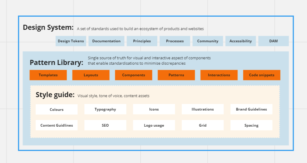
A design system – the concept defined by Brad Frost in his seminal 2015 book, Atomic Design – is a live, centralised, single source of truth (SSOT) that collects together reusable, basic components, design patterns and standards that can be used by content creators, UI and UX designers, front- and back-end developers and product owners to build products and applications.
From a visual design perspective, it defines the standards and appearance that define how user interface (UI) elements should look and feel, like icons, grids, spacing, colours and typography. This is often complemented and integrated with a Digital Asset Management system that provides assets like logos and images to product owners and content publishing teams.
Components are the building blocks of products that determine how visual assets behave and interact. This goes from individual components like buttons to complex layouts and templates for forms, search bars, articles, events and user interaction patterns. They also often include spacing annotations or are embedded alongside code snippets with detailed documentation for developers.
Because of this, design systems provide a way of continually connecting the work of designers, developers and product teams together. Or as Brad Frost puts it:
“The way you do your product development work, is how you do your design system work. These are not two separate tracks. Period… The design system must be in service of shipping real product and if it’s not doing that, it’s a failure, it’s a cost centre.”

Source: Jeffrey Zeldman, CC BY 2.0 <https://creativecommons.org/licenses/by/2.0/>, via Flickr
Design systems provide a bigger, strategic picture
Because they’re centralised, design systems ensure brand consistency in terms of look and feel across your ecosystem. And because it’s live, new styles and components can be added, or existing ones updated. This means it’s possible to iterate and respond to business challenges like a rebrand or the implementation of new functionality like AI. And ensures that different teams don’t work in silos or duplicate work that’s already been done.
A design system also gives the bigger picture of the entire brand and product ecosystem. After all, products aren't just a collection of user interface (UI) elements randomly splattered on a screen! Instead, they are organised in a strategic way to communicate key messages, encourage certain behaviours, and guide your team – and any outside agencies - to meet your business’ end goals.
To ensure design systems keep their integrity as a SSOT, there must be good governance in place, with a robust, open process to approve new entries or amendments, document them and then publish for all to use.
Once this is in place, the design system effectively communicates not just the ‘what’ anyone can design, but also the ‘how’ and the ‘why’.

Diagram presenting the different components behind a robust design system
How can design systems help deliver on accessibility?
Accessibility is about ensuring that people can use digital products and services regardless of their capabilities or skills and on whatever device they use to consume content. Whether its visually impaired people using screen readers or people with cognitive challenges needing clear user journeys. Because design systems act as SSOT, it means you can effectively ‘bake in’ accessibility principles and best practice and inclusive UX and UI design up-front.
A brilliant example of this is the accessibility principles embedded in the NHS design system which, like many major design systems like IBM’s Carbon or Apple’s Human Interface Guidelines is open source, so others can learn from it. These are just some of the ways a design system helps with accessibility.

Illustration representing different examples of digital accessibility
Accessible components
At its simplest, we can think of basic components, for example a ‘click here’ type button or an input field. By defining – and coding – components with the right, high-contrast colours, typography, spacing, Alt-text functionality, keyboard navigation support and assistive technology compatibility, it ensures wherever the components are used in products they have accessibility built in.
Making products ‘understandable’ - semantic HTML and ARIA
Because design systems include the code behind the visual ‘look’ of components, they can also build-in the use of semantic HTML elements and up to date WAI-ARIA (Web Accessibility Initiative - Accessible Rich Internet Applications) guidelines. HTML elements, like <nav>, <button>, and <label> let assistive technologies describe what objects and contents are to users. ARIA attributes give additional context for all types of assistive technologies. In addition, AI search, which we wrote about in a recent article, is increasingly prioritising structured content, so it’s a win-win on both fronts.
Responsive design implementation
Including responsive design principles ensures accessibility across different devices and screen sizes. Responsive design requirements allow for flexible and adaptable UI components that can accommodate various viewport sizes and input methods like large screens, voice commands and other assistive technologies.
User testing and accessibility auditing
This is where the ‘how’ and ‘why’ of design systems really comes into play, beyond just the ‘what’. Accessibility testing and auditing processes can be built into the design process to assess – and then improve - the accessibility of UI components and patterns.
Automated accessibility testing tools, such as Axe, Monsido and Wave, can be integrated into design workflows to identify accessibility issues. But such tools can’t pick up all issues or real-world ‘usability’, so manual testing by users with disabilities or accessibility experts provide critical insights. A general challenge which our accessibility experts are always happy to hear from you about.
Should my organisation implement a design system?
Not always, but often! Every organisation faces the same challenges when colleagues leave and there’s no single source of truth to answer questions: Did you do a handover? Are the files on the server?! All organisations can find consistency drifts away, when people bring their own ‘twist’ to their work, or don’t implement components in the same manner.
What that looks like in practice will vary. Different companies will have different needs and standards, according to their specific operational requirements and corporate policy on inclusion and sustainability, for example. Digital maturity of the organisation’s team members, the number of locations, teams and languages also hugely affect its design system requirements and the tools needed to create and management it.

Lead UX Designer working on organisation and user mapping
A design system for a multi-team, multi-national, multi-language organisation with a whole host of brands, mature products and applications, will look very different to one set up for less complex businesses earlier in their growth journey.
How can my business implement a design system?
In practical terms, it’s all about the place you are starting from, and the complexity of the business involved. For a new organisation, your design system is more of a statement of intent about how you plan to work going forward.
That means collecting together your brand guidelines and assets, your desired policies on accessibility or sustainability (for example mandating code should be lean and assets compressed), understanding how your team is structured, what types of technology you plan to use, and critically what type of user experience you want to deliver.
For existing organisations, it involves additional effort to implement because it involves taking stock, quite literally, of what you have – and what you want to have - in your current ecosystem to create a new, consistent single source of truth. Not to mentioning then, redefining and redesigning your current components and assets in line with that.
It also needs you to deeply understand how your current digital product lifecycle works in real life. It can often be easier to get outside support to guide this process and align stakeholders, as well the resulting design and technical implementation. This is particularly true when you want to deliver on accessibility best practice if you don’t have dedicated specialists within your team.
What tools does a design system require?
A design system requires a variety of tools and a well-defined structure to manage what’s needed, the choice of which will be guided by the complexity and requirements of your organisation.
These include design tools like Figma (which we use and recommend) and Adobe XD to create and organise UI components and establish consistent design patterns. And tools like Frontify and Zeroheight aim to bring much of this together, with Zeroheight particularly strong for developers and on the documentation and governance front, whereas Frontify is more content and brand guidelines focused.
This all must be backed up by version control functionality such as provided by Git, that allows teams to manage updates, track changes over time, and rollback to previous versions if needed.
Design tokens superpower design system delivery

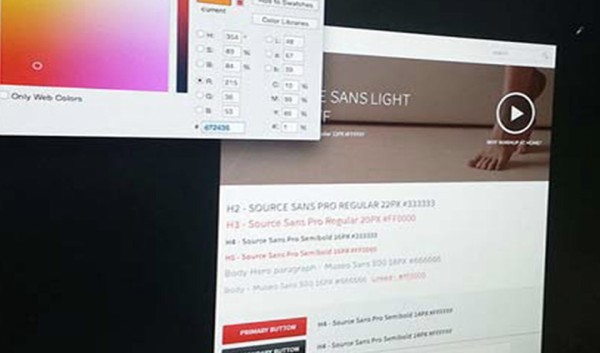
Screenshot from a UI and brand guildelines activity
In recent years, the ability of design systems to truly act as a single source of truth has been supercharged by design tokens. Design tokens are pieces of code and names that represent small, repetitive design and UI decisions that can be delivered in a platform-agnostic way. It could be a colour, font choice, spacing style or even an animation. These can be worked on and defined in Figma and, subject to the wider accessibility and user testing process, when changes are made to them, literally directly pushed into the live product environment.
We use design tokens as part of our own, unique Motherfile design system approach, which we first created as a way to streamline and continuously improve our Drupal web development process. But because tokens are agnostic, it can pushed into any of the CMS and front-ends we use for clients, whether that’s React, Vue.js, Drupal, Statamic, Wordpress or more besides.
The business benefits of design systems – efficiency and sustainability
Even when starting small, design systems allow teams to do more with less in every way – less time, less resource, less budget, less energy. Not just when it comes to designing and prototyping features, but also when building real-world experiences.
Designers can spend less time remaking components and sweating the small stuff, because previous work isn’t hidden away in a forgotten file. And because design components are already aligned with specific code, tokens and other pre-sets, developers can translate designs into functional accessible code in a fraction of the time. A design system is also an invaluable on-boarding resource for team members allowing them to contribute sooner.
Product owners and content teams can also refer to the design system to see if there’s already an AI chat bot – or not! – that they can either implement immediately or agree to add to a product roadmap, where the cost can be split across the business. Enabling everyone to have a shared vision and language to create consistent products with better UX and accessibility.
Add to this optimised product development process the implementation of a well-managed DAM that stops infinite duplications of digital assets and files hanging around in cloud storage, and you also save money and carbon emissions too.
The digital world will only get more complex, making a well-structured design system an efficient platform to build on for the future. And our decades’ experience with innovation, complex accessibility protocols and delivery of large-scale design and digital ecosystems means we’re ready to help. If you have an accessibility or design system challenge, do get in touch with our team of experts today.

