For the third consecutive year, front end professionals converged on the Netherlands for a day filled with advanced CSS talks. CSS Day Amsterdam is a single day conference by (and for) experienced CSS developers. This was my second year at the event and these are my takeaways.
After a busy night at our 10th year anniversary party, and the morning rush to get to the centre of Amsterdam in time, I arrived at the beautiful 18th century Compagnietheater right as the event began. They had my badge ready for me as I was the last attendee so I quickly made my way into the venue's main stage, where host Christian Heilmann was welcoming the first speaker.
Independent designer and developer Paul Robert Lloyd, kicked off the day with a talk about the thought process we go about when we build responsive websites and apps, the universality of the web as a media, and what we mean we we talk about "responsive".
Recalling Ethan Marcotte's talk from last year's CSS Day, Paul gave everyone a reminder of the reasons we are in this industry, and a fresh view of the things that keep us excited about it. Here is a video of Paul's presentation. He left us with three main ideas:
- Start from the point of greatest adaptability.
- Respect the diversity of our users.
- Build using systems that we reason with.

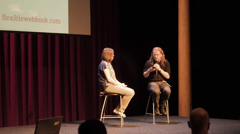
Zoe and Christian in the Q&A session after her talk.
There were two talks about the new CSS layout modules. The first one was from Zoe Mickley Gillenwater, who came to the stage to present the latest developments of the Flexbox module. The second was an updated version of the new CSS Grid module.
Zoe showed many examples of how the Flexbox module aids in the creation of responsive projects but Rachel explained how, despite Flexbox's great power and flexibility, it is not the best solution to create entire page layouts. Flexbox is better for more for specific elements whilst the Grid module is designed to create layouts. After both presentations, the audience had a better understanding on how and when to use each module and how to combine them to create great responsive solutions – especially considering that the Grid layout is still in early implementation and browser support is not widely available yet.
Before lunch break, John Daggett and Clarissa Peterson took their turns on stage. John talked all about webfonts, including advanced features like kerning and ligatures, and how to activate these features through CSS to create the best possible reading experiences.
Clarissa's presentation was about colour and how we use it on the web. We need to be careful when using colours so they are in line with the meaning of what they are presenting, and we should consider the implications of our colour decisions when different types of colour blind people use our products.
After a healthy lunch provided by the event organisers, and another talk about the CSS Grid Layout (mentioned above) from Rachel Andrew, Roy Tomeij took the stage to present a series of fun and quirky experiments that are only possible by using pre-processors. The idea of his talk was to showcase how CSS and the way we write it has evolved with pre-processors, and how they can help development by saving time and automate common tasks.
After a quick coffee break, fantasai gave a very technical explanation about how the "auto" value commonly used in the CSS width property works inside the browser. Her explanation aimed to help developers understand the process the browser undergoes to draw elements using this value, and the performance implications of that process.

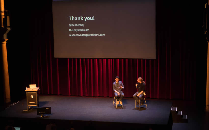
Stephen Hay in the Q&A session after his talk.
Stephen Hay closed the event with an inspirational talk about the process of developing websites. He detailed how we have created so many tools, frameworks and methodologies under the guise of simplification that, in many cases, have over-complicated our jobs and create more issues than they solve.
Chris thanked the speakers, the sponsors and the audience with an invitation to enjoy and aftermath of chat and drinks on the house. The day left me with a fresh perspective on the way I do things and why, and an excitement to apply the speakers' lessons back at Cyber-Duck.

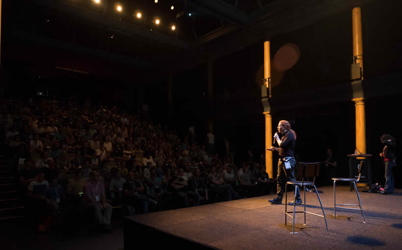
Host Chris Heilmann had fun, insightful and challenging remarks and questions for all speakers.


