Established in 2003, MWR Infosecurity offers research-led cyber security solutions for international clients. MWR’s ambitious innovation programme sets them apart; they’ve launched new services, products and R&D over the years. Cyber-Duck was chosen to develop a brand strategy that would position and unify this house of brands – delivered in a series of user-centred websites and collateral.

Awards won
- Horizon Interactive Awards - Corporate & B2B category for our MWR Countercept cybersecurity website design
Project Objectives
MWR pride themselves on being industry-leading, people focused and, above all, a brand that works hard and plays hard. Their personality, culture and values had gradually evolved over the years. This left their current visual identity and brand feeling irrelevant, dated and distant from who they were.
First, we tackled the main MWR brand and website; then, their sub-brands Phishd, Countercept and Labs. In collaboration with the client-side stakeholder team, we identified the following objectives:
- Communicate MWR’s intense client, technical and research USPs
- Position the group of brands so they could stand alone, with unifying visual features
- Convey their quirky, problem-solving, hacking philosophy in tandem with specialist professionalism
- Craft the group’s visual identity and website ahead of the competition
- Provide a web platform that surfaced their people, with focus on their role as industry educators
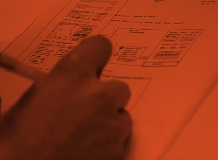
 Strategy workshop with MWR stakeholders
Branding process
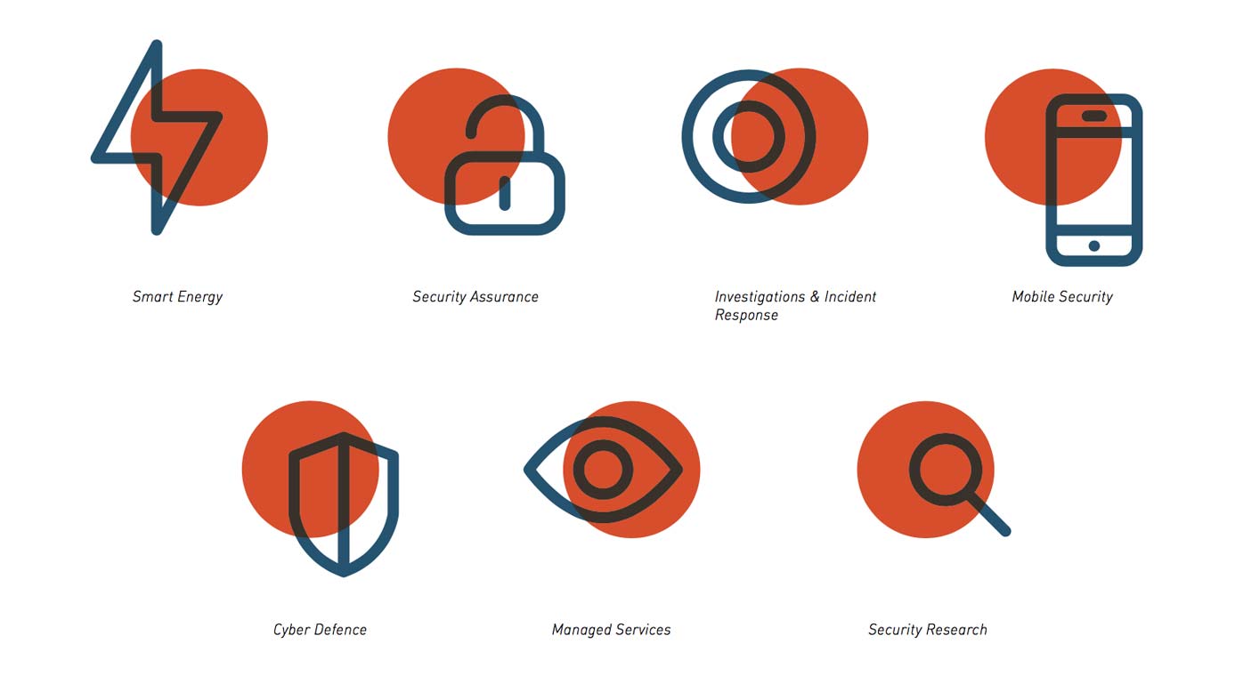
Each of MWR’s 3 sub-brands had their own focus, goal, personality and target audience. We wanted to retain the individual character and recognition each one had already built. This project would redevelop their identities to a higher standard, while strengthening their underlying connection with visual cues.
Our brand and user experience specialists collaborated with MWR to understand their vision, culture and challenges before work commenced. We studied the competition to understand what lessons we could learn; then, ran workshops focused on market positioning to help benchmark MWR.
Next, we invested time to identify key audiences. We tapped into user needs, expectations, motivations, frustrations and digital habits in relation to infosecurity. From this, we defined the core values, personality and mission of the brand, without which you can’t build a strong platform.
This provoked a creative exploration process that fed in all our great research findings. As ever, our creative team worked collaboratively with the client to provide multiple directions that could be developed into an engaging finished brand.
Website redesign
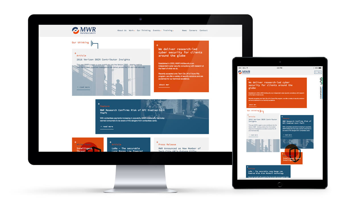
MWR’s main website was the first platform we redesigned to reflect this new cohesive identity. By following our ISO accredited user-centred design process, we delivered a website that could hit MWR’s objectives.
Integral to the website redesign was an informed content strategy, information architecture, new graphical user interface (GUI) and sub navigation systems. We also brought the fantastic content treasures and knowledge pieces the MWR experts created to the surface.

Brand Collateral

Overview
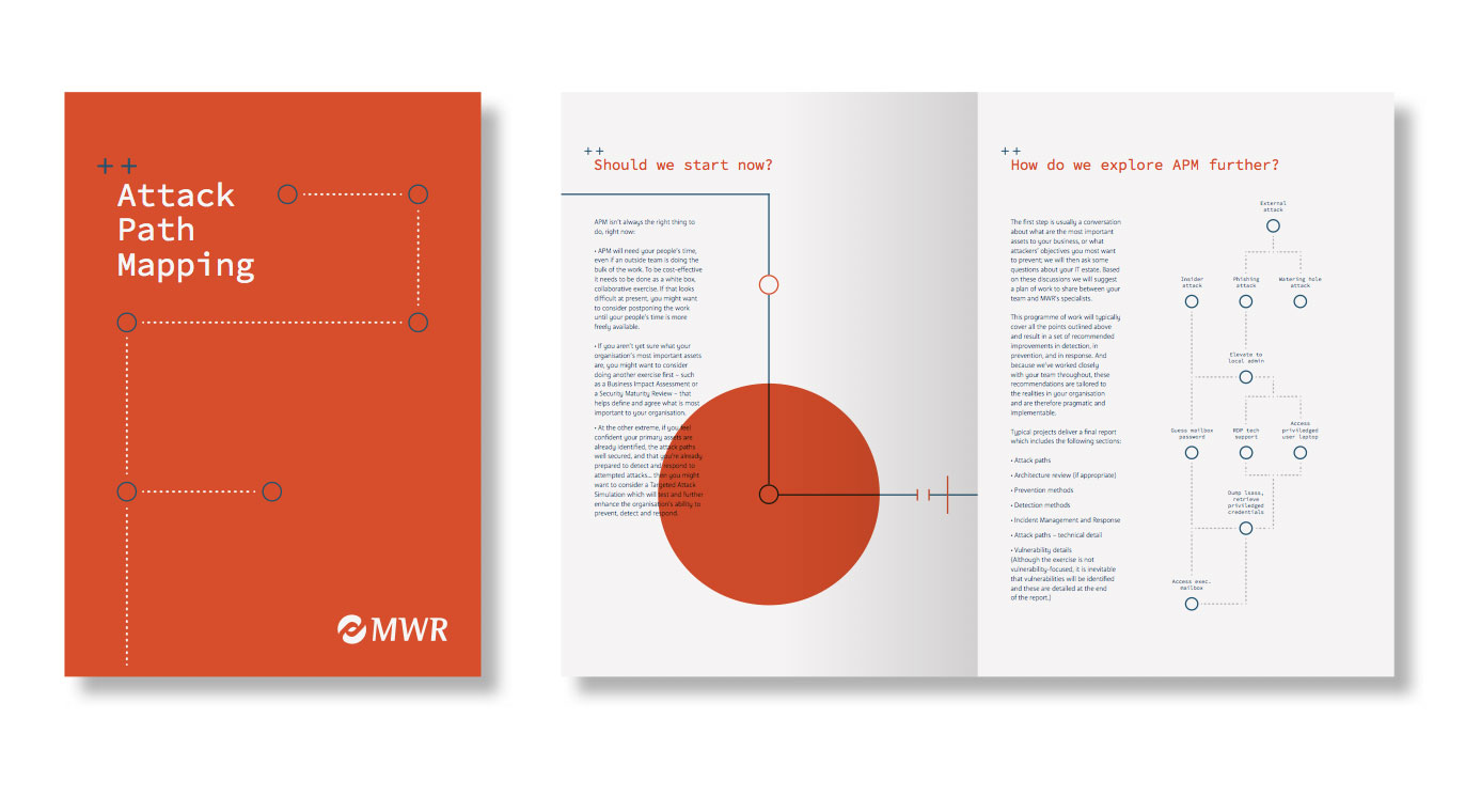
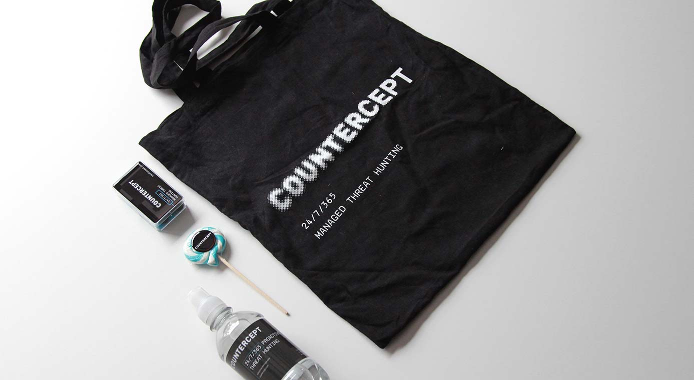
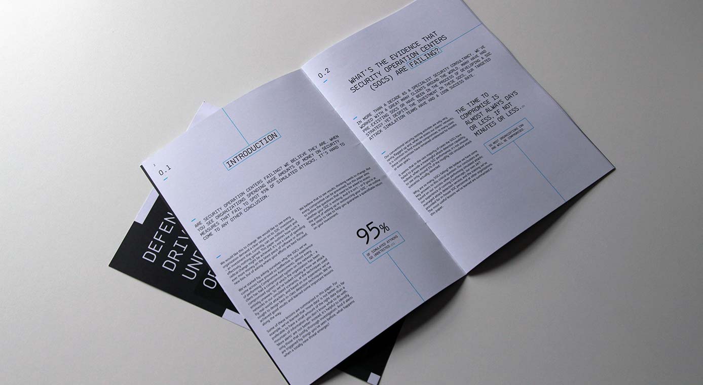
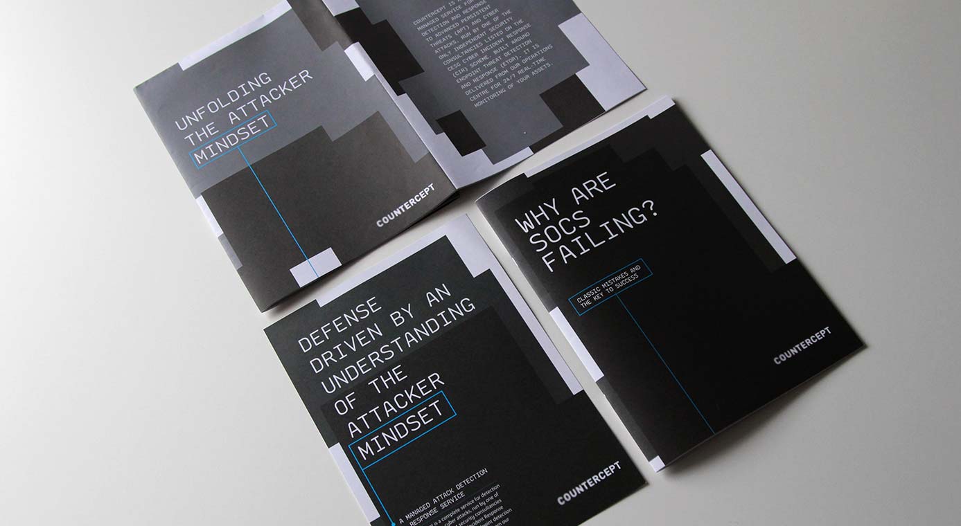
Next, we turned to MWR’s sub-brands, crafting brand strategies and standalone websites. Countercept offers companies a managed service that can monitor, mitigate and respond to advanced persistent threats (APT) and cyber attacks. We ensured Countercept could stand alone as a brand – yet have a subtle connection to the wider group – via similar quirky layouts and graphic devices.

Website
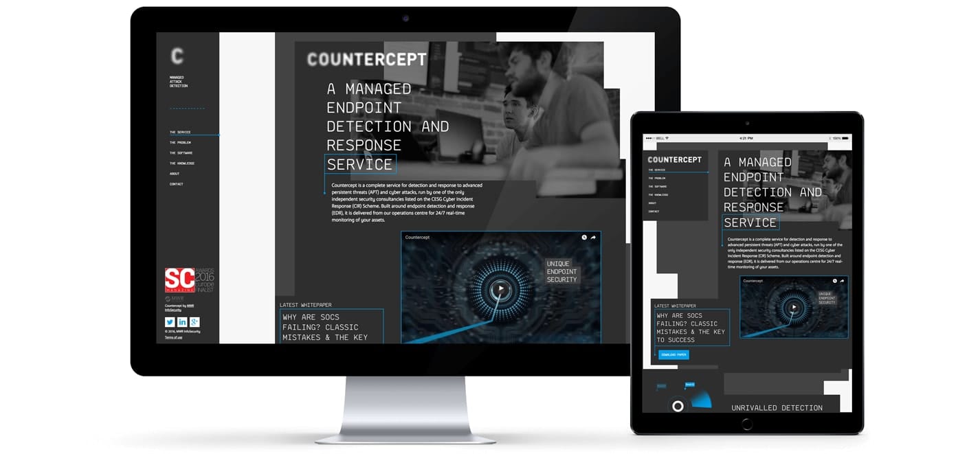
Accompanied by subtle animated images, providing bite sized content in cascading sections built understanding of the technical detail. Messaging is solution-focused for a sophisticated, knowledgeable audience.
Branding
Exhibition stand design
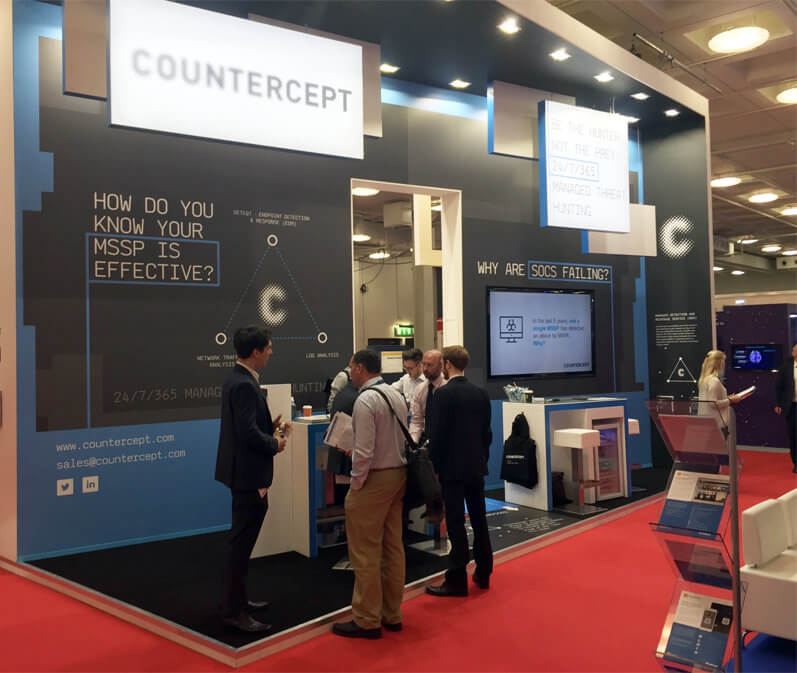
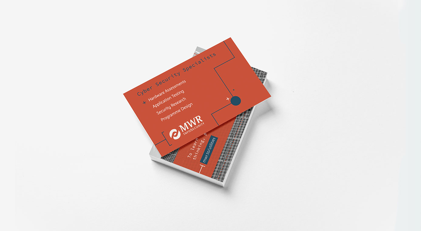
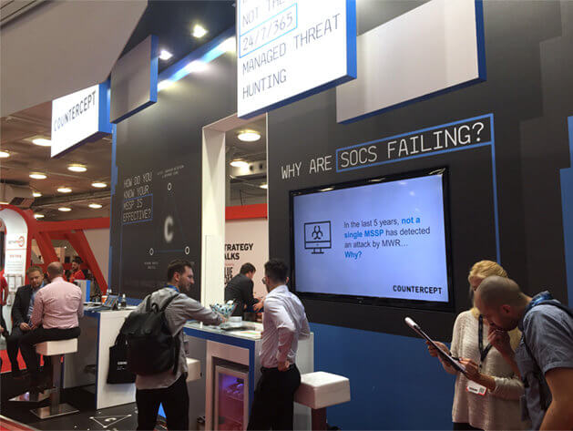
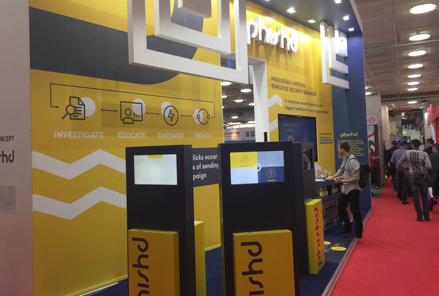
We produced numerous collateral and marketing materials during the branding process. The design was even rolled out onto an impressive event stand for InfoSec London (pictured) by MWR and their specialist stand builder.
Our favourite feature was the table top conversation aid diagram, which explained the entire Countercept process.
Brand Collateral
Overview
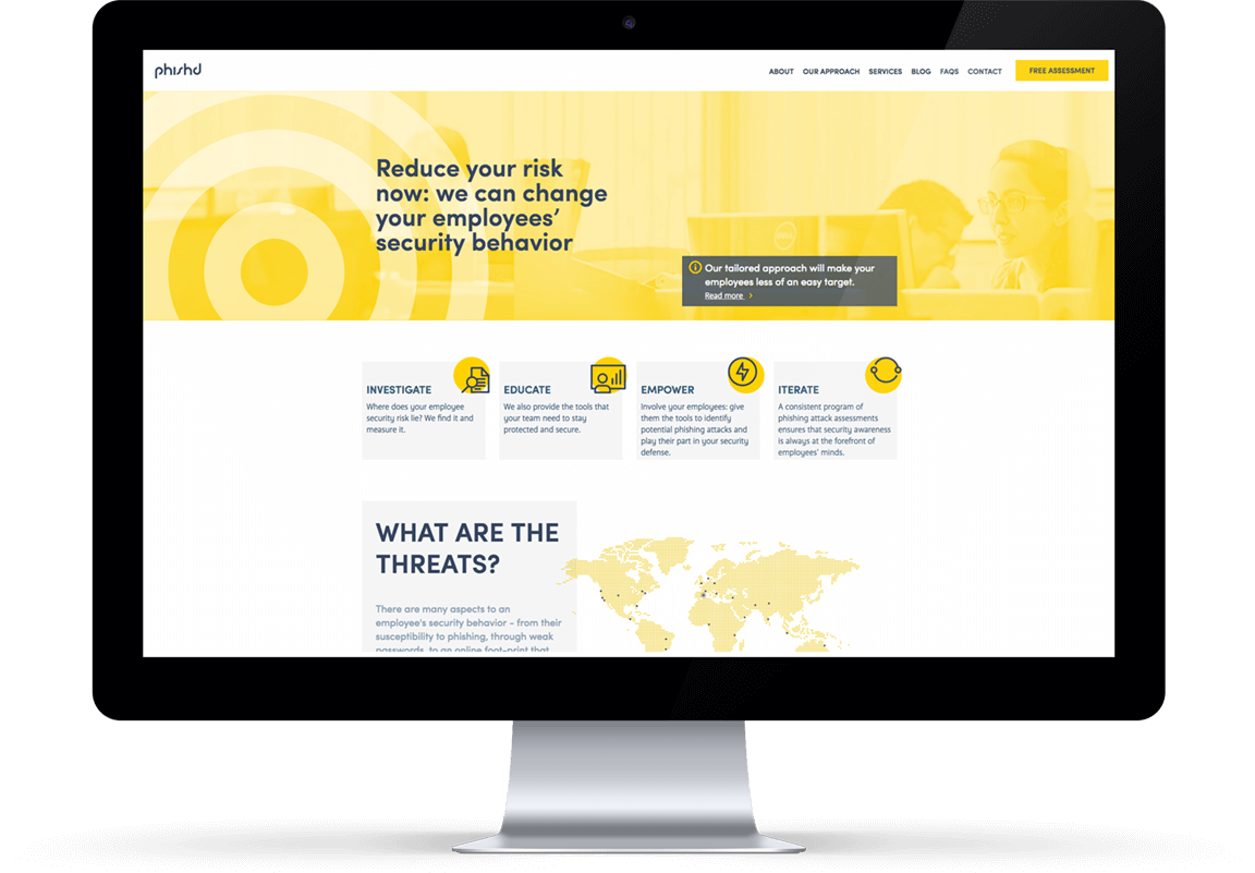
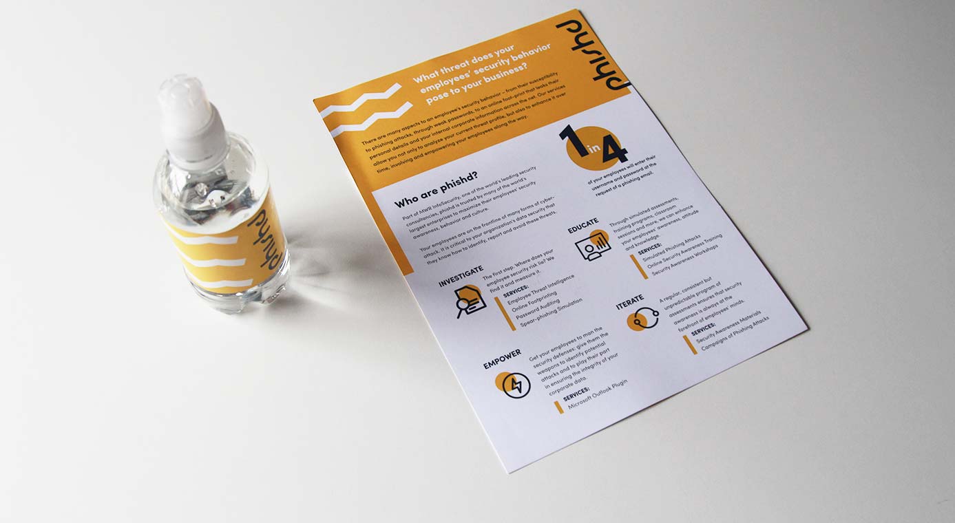
Phishd is another sub-product that required a new brand strategy and website. They provide a managed service that helps companies monitor and manage employees’ security behaviour, reducing susceptibility to phishing attacks.
Like Countercept, the brand had to feel unique, but feature subtle similarities so it could sit comfortably within MWR’s group of brands. The new identity must help mature the brand and clarify how their wider range of services set them apart.
Outcome
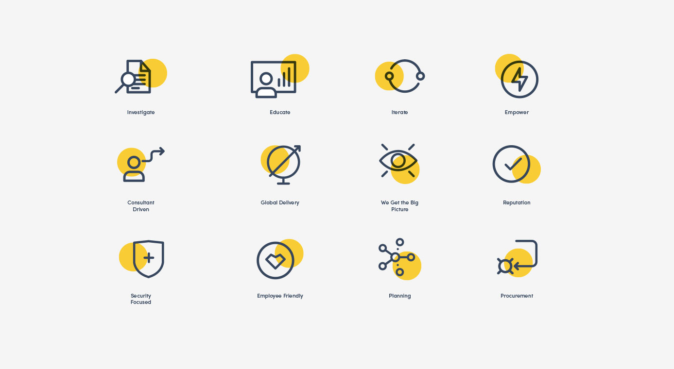
The creative brand direction – with its visual graphical devices and powerful colour scheme – was rolled out across a stand-out responsive website. The logical architecture and clear messaging helped them drive further awareness and thought leadership as the highest accredited company in their industry.
Branding
Exhibition stand design
Brand Collateral
Overview
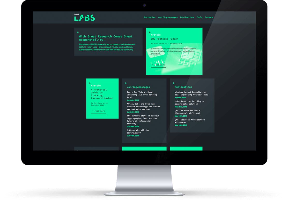
MWR believed their dedicated Research & Development (R&D) capabilities drive the high-quality service provided to clients. Each consultant dedicated 25% of their time to security research that pushes the boundaries! MWR Labs was their platform to dissect trends and share tools. Our final website design needed to help it stand apart.
Website
The LABs website is an intentional reflection of the main MWR website, but with a very different visual look and feel. The brand visuals are based on the terminal colour scheme and had a glitch-feel that is associated with the hacking community.
It has a creative interface to switch between the two. This sub-site reflects the other side of MWR, which includes their industry contributions and tech-centric thought leadership.
Cyber-Duck helped us to define a strong platform and strategy for our group of brands. They worked collaboratively with my MWR team to really bring our vision to life in these brands, websites and the rollout within marketing material.
Charlie Rhodes Group Head of Marketing