Skip to content Skip to search

Cyber-Duck has developed a close digital partnership with the Bank of England. Together, we ensure the Bank’s digital identity reflects its powerful role maintaining the UK’s monetary and financial stability.

We crafted a colossal content strategy and user-centred design for the Bank’s main website. This project was part of the Bank’s wider customer engagement strategy. Cyber-Duck’s approach won the Agency Team of the Year at the Wirehive 100 Awards.

Key stats

6%

increase in organic traffic

308%

increase in social traffic

22%

increase in mobile traffic

Watch the redesign story

Objectives

Founded in 1694, the Bank of England’s mission is to maintain monetary and financial stability for the UK. But its previous website hasn’t helped people understand this in the past.

The Bank’s key information, news and resources were hard to find, the visual identity looked dated and ultimately didn’t satisfy their diverse audiences. The website just didn’t reflect who the Bank is today.

That’s why Cyber-Duck was brought in. Using our accredited user-centred design approach, we planned to design a captivating and user-friendly website for the Bank.

This was a key part of the Bank’s customer engagement strategy, which aims to communicate more effectively with the British public alongside specialist audiences. Cyber-Duck’s objectives were to:

01

Design an engaging website that could address the needs of a hugely diverse audience, from specialist economists to students.

02

Craft a content strategy that rationalised and migrated over 4,500 individual web pages.

03

Develop a design system: a one-stop-shop for the Bank staff to create consistent, great content.

User Experience Strategy

In less than four months, we had two big challenges to tackle. Firstly, we needed to address the scope of the audience’s needs. Our process could ensure the Bank had a website that made their inner workings more understandable to far broader audiences than before.

The Bank’s researchers and marketers, Museum staff and even the Governors themselves got involved with the project. Our workshop sessions identified its staff’s expectations. Together, we agreed design principles that would guide the project.

Driven by stakeholder interviews and first-hand research, we crafted seven personas: Economist, Investor, Journalist, Independent Financial Advisor, Business Advisor, Student and Educator. Each persona detailed their characteristics, habits, motivations and frustrations. This informed the information architecture, content and design throughout the project.

Content strategy session with post it notes for card sorting

Content Strategy

This research showed that users enjoyed the Bank’s content – they just couldn’t find it. The website’s existing structure was inaccessible. So next, we tackled the scale and findability of the existing content.

Our content audit and strategy could help the Bank become the trusted economic voice of the UK public and finance sector. We absorbed and rationalised all the content – 4,500 web pages and over 20,000 PDFs – into a new information architecture, creation and migration plan that simplified all user journeys.

User Testing

This project was the first time the central bank has refreshed its digital presence with such a focus on the end user. Validation through user testing is a core component of the Cyber-Duck process.

We explored our solution in digital, interactive prototypes that we showed to and tested with a variety of real users. This meant we could mitigate issues early and create a platform that everyone loves.

User testing session

Website Design

For the visual design, we looked at the Bank, its people, its building and its printed material for inspiration. We combined the Bank’s official typography and bold photography with vibrant colours – including the traditional doorman’s pink uniform and a strong navy blue – to create a traditional yet exciting palette. Take a look at the new homepage!


Website screenshot

The Bank’s key responsibilities are summarised and linked directly from the homepage.

Headline news and figures are now easily accessible. Users are invited to search to discover the content they need.

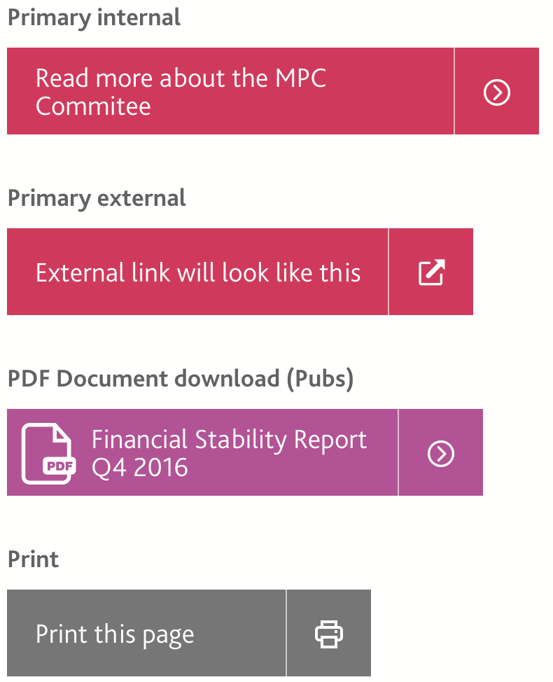
Buttons

Design System

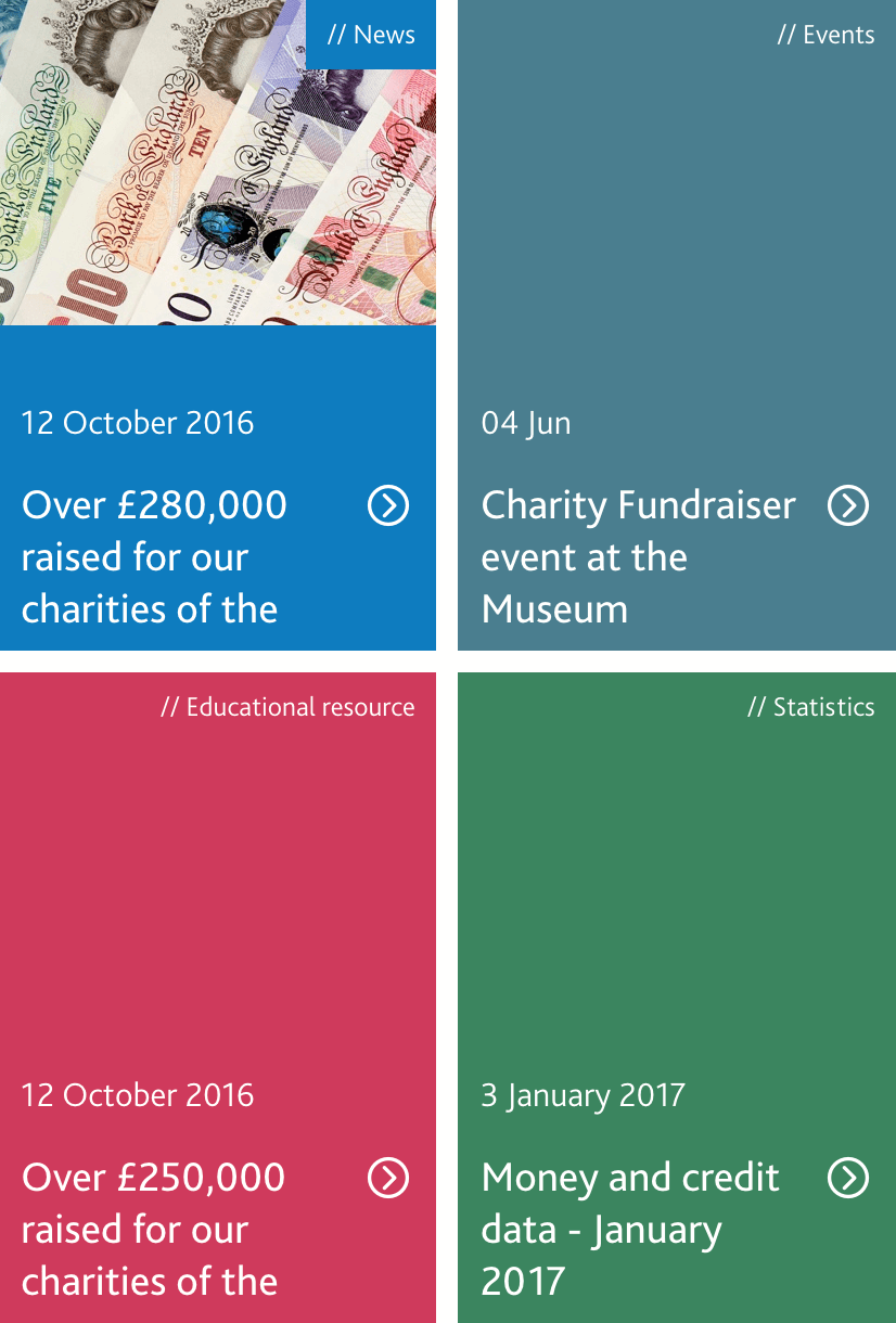
Once the art direction was polished, we created a design system for the Bank. By establishing a core visual, written and code patterns for the future, the Bank could maintain a cohesive experience for users.

Our Digital Guidelines included the website’s principles, tone of voice, accessibility values and design patterns, such as colours, fonts, image blocks and forms. Everything was accompanied by detailed examples. It’s a one-stop shop for the Bank staff to create consistent, great content.

Publications

The Results

The finished website design is a far cry from the old one – a truly modern experience that reflects who the Bank of England is today. Its bold design and user-friendly organisation sets it apart from other financial institutions. Led by the Bank’s Head of Digital, the website ultimately got approval from Mark Carney himself.

The new accessible website is designed for all. It educates users about the Bank’s role while still providing high-quality, specialist information for those who need it.

Early statistics indicate that the average time spent on the Bank’s website has increased by nearly 30%. The team is providing continued support to ensure the user journeys are fully optimised. Cyber-Duck’s unique approach won the Agency Team of the Year at the Wirehive 100 Awards.

Bank of England

Cyber-Duck has played a key role in the re-launch of our new digital identity. Their user-centric approach has produced a new content architecture that is much leaner; user journeys are now designed around our key audiences and supported by beautiful templates. The team is always professional, yet friendly and approachable, which made the project enjoyable.

Head of DigitalThe Bank of England

Share your vision. Let's work together

Whatever the project or particular challenge you have in mind, we’re here with the right people, process and technology to help deliver the transformation you need.

Talk to us